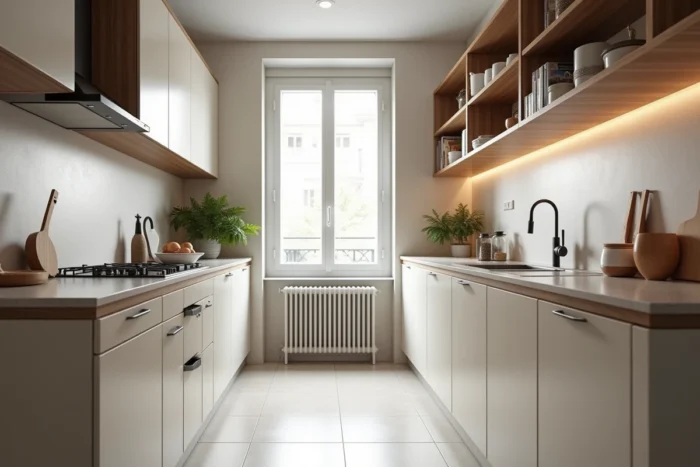
In a small kitchen, every decorative choice has a measurable effect on the perception of space. Wall color, type of lighting, flooring format, and the number of visible objects on the countertop: these parameters directly influence the feeling of spaciousness without putting up a single partition. The following ten tips target the most effective visual levers to visually enlarge a small kitchen, categorized by intervention area.
1. Monochrome palette from floor to ceiling to eliminate visual breaks
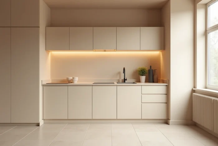
A strong trend in recent years is to treat walls, furniture facades, backsplashes, and sometimes floors in shades close to the same hue. This monochrome palette removes contrast lines that visually segment the room. The eye glides seamlessly from one surface to another, elongating the overall perception of volume.
Off-white, greige, or pearl gray work particularly well. If you’re looking to understand how to visually enlarge a small kitchen, this principle of chromatic continuity is the most cost-effective starting point in terms of the effect achieved.
2. Peripheral lighting with LED strips instead of a central ceiling light
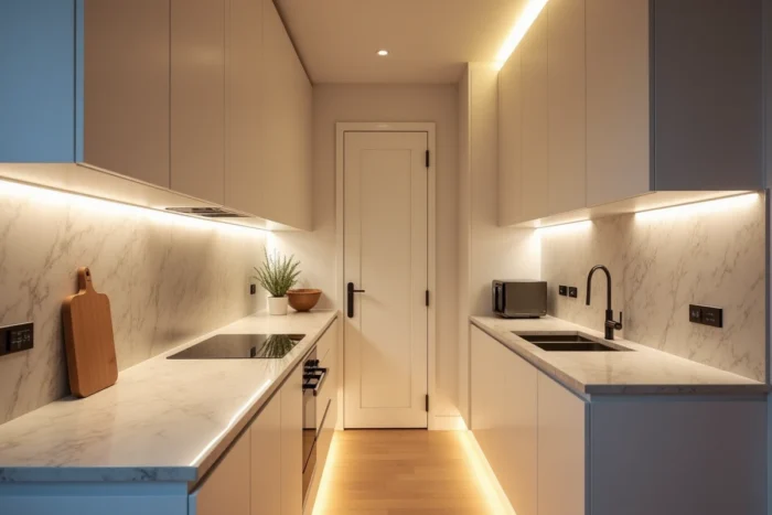
A single ceiling light in the center of the room casts shadows that visually shrink the space. The opposite approach, documented by several decorators, relies on peripheral lighting: LED strips under the upper cabinets, recessed spots along the edges, integrated lighting under the countertop.
The principle is to read the ceiling as a continuous plane, without any element hanging in the middle. Light coming from the edges expands the room and eliminates shadow areas that compress the space. Favor a color temperature around warm white to maintain a welcoming atmosphere.
3. Mirror or reflective backsplash to double the depth
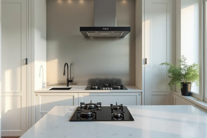
Installing a mirror or a reflective lacquered glass backsplash between the countertop and the upper cabinets creates an immediate depth effect. The surface reflects natural light and visually doubles the background of the kitchen.
This lever works even better in a narrow kitchen. A mirror placed on the longest wall accentuates the perspective. For open kitchens, it also captures light from the adjacent room, which unifies the lighting and pushes back the perceived limits of the volume.
4. Large format flooring laid continuously
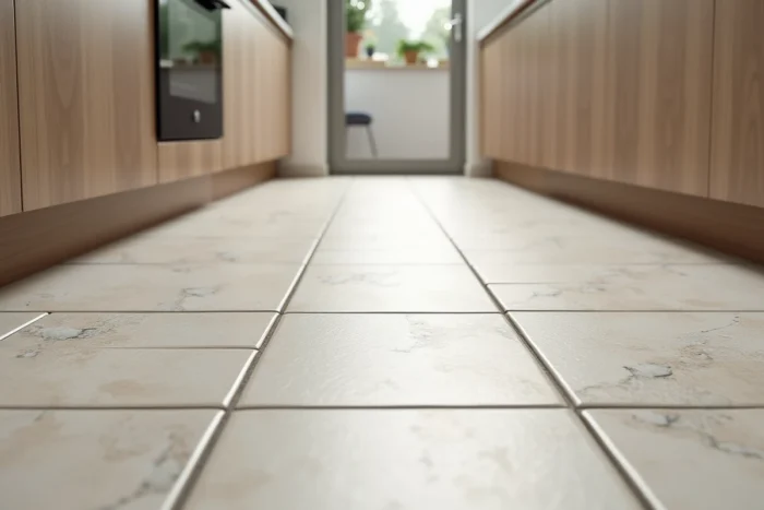
The larger the tiles or floor planks, the fewer visible joints there are. Fewer joints mean fewer cutting lines that fragment the floor surface. A large format tile laid continuously from the kitchen to the adjacent room removes the visual boundary between the two spaces.
Conversely, mosaic tiles or different flooring in each room accentuate the feeling of compartmentalization. If the budget does not allow for changing the floor, a large format vinyl rug with a solid pattern creates a comparable effect without any renovation.
5. Clear countertop with two or three chosen objects
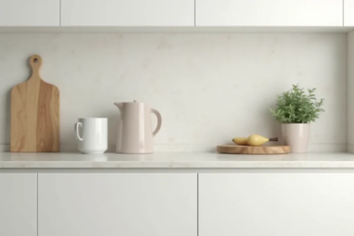
In recent years, the decor trend favors an intermediate approach between a completely empty kitchen and an overloaded one. The principle: massively clear the countertop but intentionally leave two or three objects in view (quality coffee maker, beautiful wooden board, graphic jar).
This “layered” logic maintains a warm atmosphere without breaking the enlargement effect. Each additional visible object on the countertop reduces the perceived surface. The test is simple: if an object is neither beautiful nor used daily, it goes in a cupboard.
6. Handle-less cabinet fronts aligned with wall color
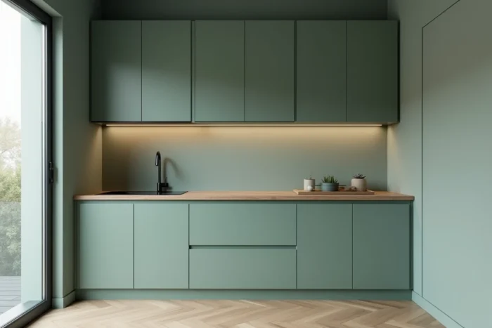
Push-to-open fronts without handles eliminate prominent horizontal lines that catch the eye and fragment the wall surface. When these fronts adopt the same hue as the wall, the furniture blends into the wall and the kitchen appears to contain fewer pieces of furniture than it actually does.
This principle also applies to upper cabinets. By extending them to the ceiling in a color identical to the wall, the lost space above the cabinets is eliminated, and the perceived height of the room is drawn upwards.
7. Open shelves on a wall to create depth
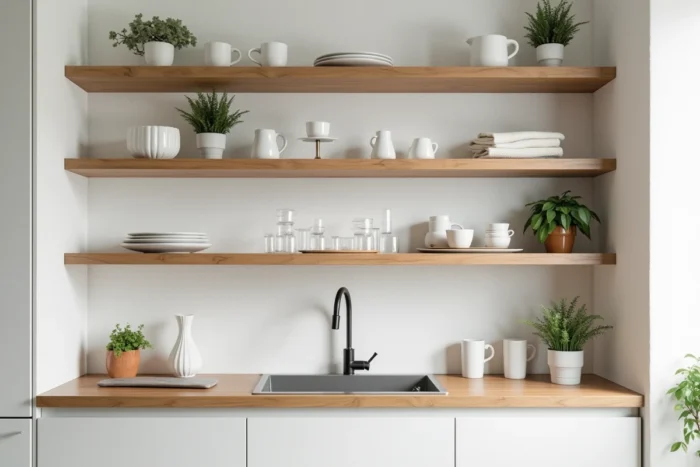
Replacing one or two closed upper cabinets with open shelves lightens the visual mass in the upper part of the kitchen. The wall remains partially visible behind the objects, creating an additional plane of depth that full cabinets eliminate.
The common trap is to overload these shelves. Three to five objects per shelf are sufficient. Beyond that, the effect reverses, and the kitchen appears cluttered. The shelves function as a frame: what they display should be as carefully selected as the objects left on the countertop.
8. Built-in and integrated appliances behind facades
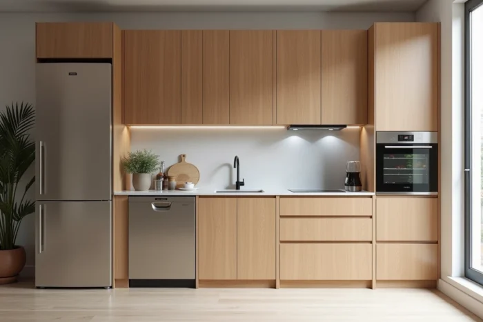
A prominently placed refrigerator or a microwave on the countertop creates a visual break. Integrating appliances behind uniform facades smooths the reading of the space and frees up visible surface area.
For those who cannot build in, grouping appliances in one area and partially masking them (dedicated niche, curtain matching the kitchen) limits their visual impact. The goal remains to reduce the number of distinct elements the eye has to process.
9. Sheer or transparent curtain instead of opaque to maximize light
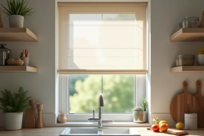
A thick curtain or blackout shade cuts off the visual connection with the outside and darkens the room. A light sheer or semi-transparent roller shade lets in light while preserving privacy.
In a kitchen without a window or with a small opening, this parameter becomes crucial. Every gain in natural brightness expands the perception of space. If the window faces a direct view, a frosted adhesive film provides the same filtering without blocking light.
10. Clear visual line at eye level in an open kitchen
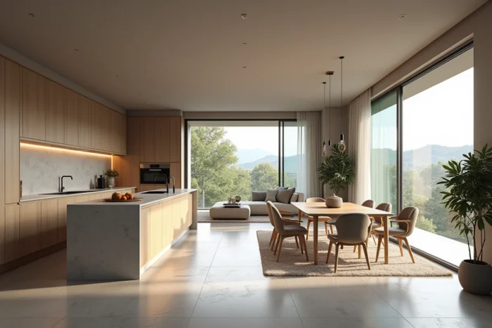
In an open kitchen, the height at which the separating furniture stops radically changes perception. A counter or bar that does not exceed the height of the countertop allows the gaze to cross into the adjacent room. The kitchen then visually borrows the volume of the living room.
Removing upper cabinets on the opening side (or limiting them to one side wall) reinforces this effect. The basic rule: nothing should block the view at eye level between the kitchen and the living space. This visual clearance matters more than the actual size of the room.
Among these ten levers, the chromatic continuity of floor-wall-facades and the clearing of the countertop produce the most visible results for the least effort. Each works in isolation, but their effects accumulate: three or four of these tips combined are usually enough to transform the perception of a small kitchen.